In part I didn't originally intend for these to be part of the class. This was more an attempt to get my creative juices flowing, and attempt that didn't really pay off in the long run, but did get me to at least create these.
Below is an early rough attempt.

The first example (above) is most typical of my early attempts at the thematic style I intended in the story. WWII in space. I'll be the first to admit it has been done before, although how literal it was taken sits on a spectrum. This is inspired in part by the process behind a lot of scenes from Star Wars.

 This would obviously be seen as a less literal interpretation of WW2 in space, with ww2 movies and footage serving as an inspiration rather than a direct mold for Star Wars.
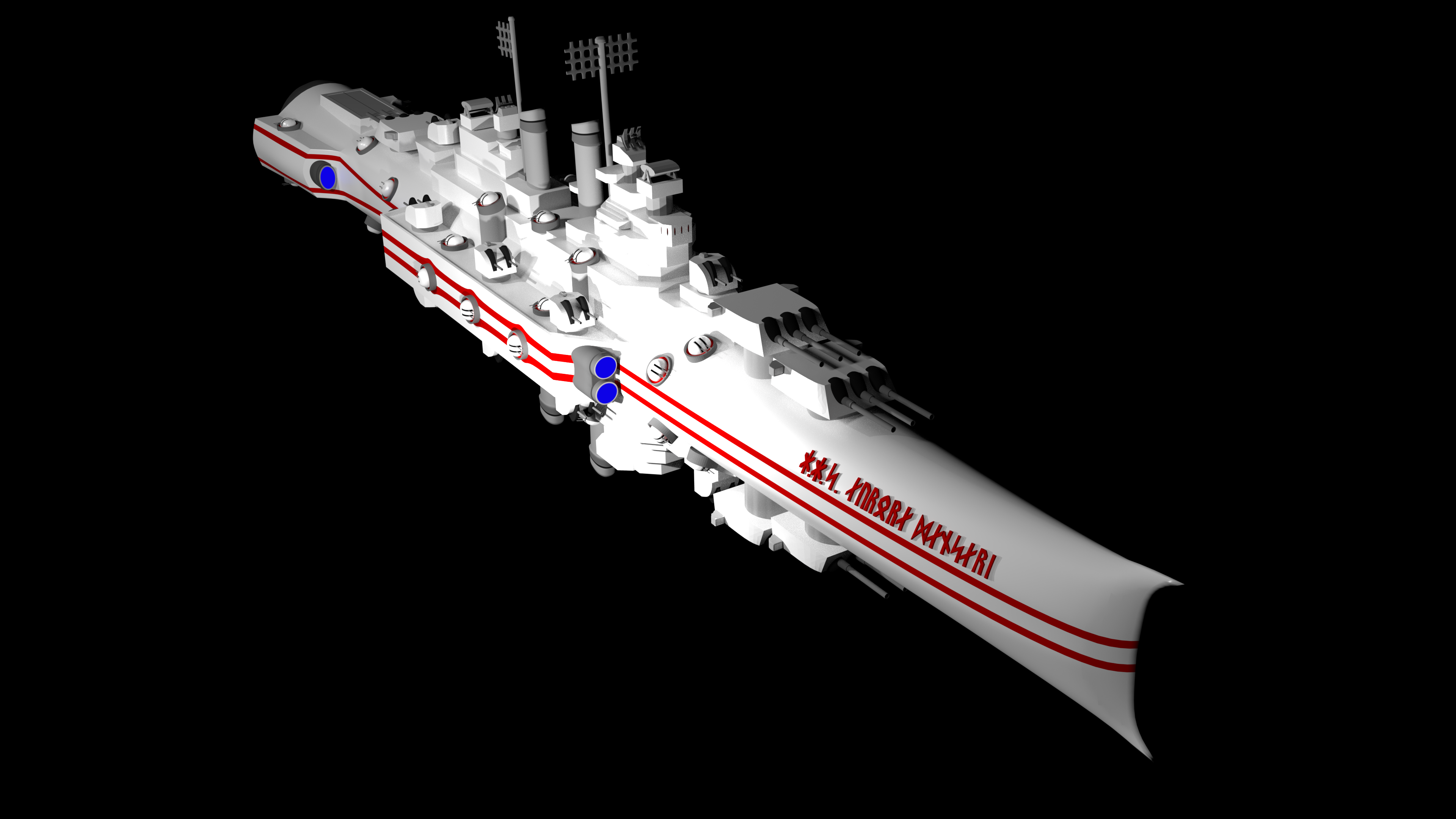
On the other hand, we have the Space Battleship Yamato, obviously a far more literal WW2 in space, in that in the story it is literally the Battleship Yamato being converted into a space ship and sent into space. My intentions leaned far more to this side than towards George's interpretation.
The overall style is simple. Take a WWII ship and mirror it. While it's hard to see the style does have a few more nuances than that. While hard to convey at this scale and angle, the ships aren't flat on the top and bottom, rather, they are curved, and pinch flat vertically towards the front. The large rectangular shapes on the side are extensions, and the soft gray and blue detailing on those extensions, and on the back, are the starship's propulsion.
I didn't stop at the first ship.

That top ship is my own interpretation of a "Space Battleship Yamato," in my sort of mirrored style. It along with the fourth ship down are the only non American interpretations I've done, the rest being United States Navy ships. The specific classes are as following.
1.) the Yamato class Battleship
2.) the Baltimore class Heavy Cruiser
3.) the Cleveland class Light Cruiser
4.) the Chitose class Light Carrier
5.) the Porter class Destroyer Leader
6.) and 6.5) the Buckley class Destroyer Escort
Number 2, the Baltimore is the most developed of the designs. Having that 2d image, as well as a 3d image I worked 12 hours with a friend to create. (Him doing the hard work and modeling, me filling in each detail the 'pixel' drawing failed to convey.) (below)
The model does a better job of showing off the shape of the ship. Capturing, the less than imagination grabbingly named, "toothpaste tube" shape the first three and the fifth ships have.
You can view the model here, though it lacks any of the colorations, due to the format of the viewer.
The first diversion from that design is the Chitose, the fourth ship from the top. Part of the design change was to try and convey the different intent of this ship. The large rectangular gray section towards the mid back of the ship are a set of massive hangar doors, intended to let fighter craft come and go. And the sort of fence hanging from the top front of the ship are intended to be extensions of the "catapult," the rail that launches the fighters into battle. Plus, I wanted to mix things up just from a creative standpoint.

The art for the fighters it carries is older than the rest of the art, drawn before this class.

The other divergence from the style is the 6.5th ship.

The Buckleys. The one on the left is more traditional, it follows the toothpaste tube shape, it's the only ship with it's own unique turrets (they are just a smaller version of the secondaries the cruisers have), which stems from it having 3 inch guns, which none of the other ships have.
This was after I had made the Yamato, and I was kind of burned out on the style of the toothpaste tube, so I figured since this was a destroyer escort, and the least miltary of the ships, so I thought I'd mix things up again.
Although, this again requires some explanation, the segmented look was intended to be concentric cylinders. It was unintentional, but that combined with the new front shape gave it more of a submarine shape.
The emblem on the side of half of the ships is yggdrasil, the world tree of norse mythology. I talk a bit more about it in the last draft of the NSR Jomsflot Officer Uniform.


Not really sure how to end this one.


